
Did you “C” the New Logo?
Cleveland’s past caught up to the future after a Nike creative team worked with students, administrators, and alumni for six months to design a new logo and revealed their work at a special assembly Jan. 31.

New Logo Created by Nike’s Global Identity Group ( GIG ) with input from Students, Alumni, Staff and Administration
March 21, 2019
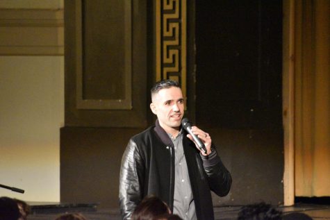
Paul Sullivan, one of the directors of Nike’s Global Identity Group unveiling the new logo.
For the past 30 years, Cleveland had used a variety of logos on uniforms and printed materials and school administrators thought an update was needed to rebrand the school and present a unified image. The original “C” with the word “Warriors” running through it was created by Kendra Gardner, the school’s athletic director, in the ‘90s.
Principal Ayesha Freeman, with the help of Athletic Director Nathan Stanley, contacted Nike to see if the company would do the work on a pro-bono basis, considering Nike’s founder Phil Knight is a Cleveland alumnus. After approval from several key people in the district, including Julia Brim-Edwards, a PPS board member and Global Senior Director for the Government and Public Affairs at Nike, it was decided that Nike would be the company that would help Cleveland create its new logo.
The rebranding started last July with the assistance of Paul Sullivan, an art director at Nike’s Global Identity Group. Sullivan worked with a committee consisting of Cleveland alumni, administration, teachers, and eight students representing different teams and clubs.
This project was Sullivan’s first time working with high school students and he had nothing but positive things to say about the experience. “Cleveland High School students were honest, open, and very engaged. All groups brought great points to the table, inclusive of past history and how they believe Cleveland should be represented in the future. The finished identity could not have been brought to life holistically without Cleveland’s community to make it authentic,” he said.
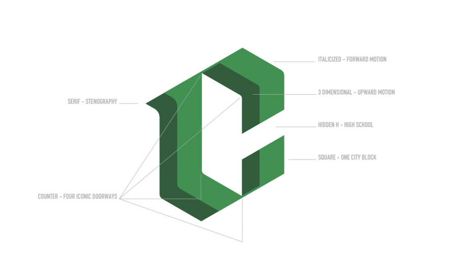
At the assembly, Sullivan revealed the new logo and also explained the many components that represent the past, present and future of Cleveland. These components include the serifed style of the “C” that represents our history as the Stenographers, when Cleveland was known as Commerce High. The italicized style with the three dimensional look shows the “C” facing upwards towards the future, and building up. In addition, the inside of the “C” has a parallelogram shape in which each of the four corners represents the four iconic doorways of the school, and on the inside, a hidden “H” that represents “high school.”
Students were noticeably excited at the end of the presentation when they went to a designated spot for their grade to receive a free t-shirt, kindly donated to the school by Nike.
Stanley’s role in the rebrand was acting as a liaison between all the different groups. He got an inside look into the process and said, “What was interesting there were a lot of intersections where people from very different backgrounds and stages in their lives had very similar things to say about Cleveland. So it was very cool as an observer to see how people really had a clear idea about what it means to be a Cleveland Warrior.”
Peter Predisik, Cleveland’s student body president, said the new logo will benefit the school in the long run. “I feel that [the logo] gives us more recognition if a lot of kids wear it for a long time. People will start saying, ‘Oh that’s Cleveland.’ It gives us recognition.”
Predisik was one of eight students who served on the rebranding committee. The others were sophomore Kaelan Anderson, juniors Lorelei Bauman, Warner Cole, Kira Swinth, and Nick Brink, and seniors Ben Harding, and Ethan Lee.
Not every student has the experience of working with an art director from Nike, and Swinth was really impressed with Nike’s involvement. “I would say they took it very seriously. I felt we were prioritized equally as some of the big teams they’ve worked with such as the NFL and NBA,” she said, adding, “Even though we’re just a high school in Portland, Oregon, we were still thought of as an important client and that they wanted to get right. I was impressed about their dedication with their ability to incorporate a story into their work and their kindness towards us students, and they really valued our opinion.”
While being very impressed with Nike, Swinth thought there could have been more student body input. “I think in the initial stages of understanding what Cleveland is they could have incorporated more students … then had smaller focus groups.”
Student Warner Cole, who represents football and track, said of the final product, “I think it was a great compromise. It was a great collection of everything that we wanted and it really represented Cleveland, and it was a mix of the old and the new and once it was broken down and what everything meant and the symbolism, I thought it was really cool. I was really happy with it [the logo].”
Stanley said the athletic teams will be in the process of changing the logo on uniforms, but it will take time.
When creating something as important as a new identity for a school, it takes many drafts to incorporate what a majority would agree on. Working through the drafts of different logos it was made clear that the students wanted something that would resonate with a wide group of people and wouldn’t be specific to one person or thing, such as the personification of the Warrior. Throughout the process there was two cycles where designs were shown to the different groups and feedback was taken. During each of the listening sessions a draft of the logo would be presented through a slide show then the concept and story was explained. Afterwards they were given a feedback sheet where they had questions that Nike wanted answered about specific parts about the presented rough draft.
Sullivan took that idea and created a logo that in his words “…did not identify with the personification of a warrior, but rather more with the warrior spirit. It transcends where the warrior comes from or who they identify with. It truly describes a Cleveland warrior: competitive, motivated, reliable, and aware of their environment in Portland and the world.”